

")
If I said to you ‘let’s talk about business cards’, what comes to mind?
That scene in American Psycho…right?
If you’ve seen it, you know it. If you haven’t, watch it now. It’s OK, I’ll wait.

It is a masterful scene. Brilliantly executed. Director Mary Harron, designed a sequence that captured the thought-provoking apologue of the entire film in under three minutes. Subtle. Deep. Memorable.
“Look at that subtle off-white coloring. The tasteful thickness of it. Oh my God, it even has a watermark.”
Christian Bale as Patrick Bateman in ‘American Psycho’
Metaphorically (and in some ways, ironically), your business card should be executed with the same attention to detail as this scene. Your card is a conversation starter, an extension of you and your brand, and an amazing opportunity to tell your story at a glance.
Yet somewhere along the way, many businesses have devalued and possibly even ignored the importance of intent, design and story – the same way many studios have devalued the importance of scene execution.
From a business development standpoint, this is a huge mistake. Thankfully, a remedy is one thoughtful redesign away. Here’s what to do:
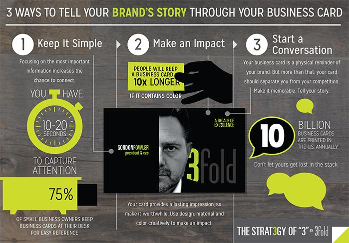
Prioritize critical information and elements needed on the card.
The order of information (from most to least important):
- Name
- Company name and/or logo
- Phone
- Email address
- Title
- Physical address
- Twitter handle
- Facebook address
- Social media icons
- Website
- Department
- Tagline
- License number (ie: contractors only)
- Fax (seriously though, let’s hope not)
- QR code (please don’t)
Work with a professional designer.
Even if you use “Silian Rail” or “Romalian Type with raised lettering” or “Oh my God…a watermark,” a professional can help convey your story and lay out a card with the intended impact.
Be brand consistent.
Your card is an extension of your brand. As you drive people to your company’s website or to engage in a conversation, the card should be consistent with and a reflection of your brand positioning.
Don’t be different to be different, be different to differentiate.
Using a non-traditional card size or material is a good example of being different to be different. For the most part, these cards tend to be memorable for the wrong reasons. They don’t fit in a wallet or in a stack on a desk drawer, and, subsequently, tend to find their way to the trash bin. Focus on using design, paper stock and unique visual elements to differentiate; don’t try to reinvent the wheel.
Business cards can start a conversation, tell a brand’s story, communicate a brand’s expertise and create a relationship. Treat them with the respect they deserve and a craftsmanship worthy of your name and your business.
Keep it simple. Keep it real. Make an impact.
3fold Communications, a leading marketing and advertising agency headquartered in midtown Sacramento, specializes in creating one-of-a-kind strategic communications campaigns utilizing creative approaches. Beyond its many awards and successful client partnerships, 3fold Communications is committed to the growth of the community where its employees live, work and play. It’s a commitment that gives the agency a unique, comprehensive understanding of Sacramento and its residents. To learn more, visit www.3foldcomm.com.