Science can be intimidating. So can math, literature, philosophy and other subjects students might encounter on campus. Education architects are finding a way to demystify daunting disciplines through open, accessible building designs that allow students, staff and faculty to interact in a more collaborative way. The same applies to student housing, museums and dining and recreational facilities. With students of all ages experiencing an increase in mental health challenges, architects are designing spaces that not only look good, but are good for occupants’ well-being. Designs are increasingly taking the physical, mental and emotional health of occupants into consideration, adding more collaborative, accessible and all-gender spaces that promote welcoming and safe learning environments for all.
The Ernest E. Tschannen Science Complex
Location: Sacramento State University
Architect: CO Architects
Contractor: Sundt Construction
Completed: 2019
Size: 94,000 square feet
Cost: $91 million
LEED status: Gold
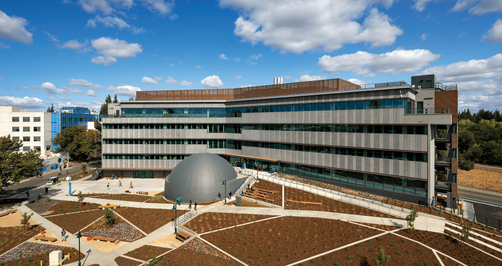
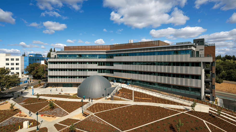
The Ernest E. Tschannen Science Complex at Sacramento State.
Photo by Tom Bonner, courtesy of CO Architects.
Sacramento State was in dire need of a new science and mathematics facility. Its primary space, Sequoia Hall, was originally designed in the 1960s and consisted of dark, narrow hallways with closed doors and spaces that limited interaction. “There was no engagement whatsoever or opportunity for learning happening unless you were on the other side of those doors,” says Tania Nunez, facilities project manager with Sacramento State. “We really wanted to change that for a lot of reasons.”
The university was intent on creating an open and collaborative space that was good for students, faculty and the community. Its mission: science on display. The result: the new Ernest E. Tschannen Science Complex, which boasts a five-story modern science and mathematics building and 120-seat planetarium, sited near the banks of the American River.
The architects pulled design inspiration from the nearby river, traversed by a pedestrian bridge. The 40-foot diameter domed planetarium serves as a metaphor for a stone dropped into the river and sits at the nexus of the two wings of the building, with ripple effects out to the campus.
To ensure the facility was designed to meet the needs of its users, every instructor interacting with the space was given the opportunity to provide input. Students were also solicited for feedback. “Finding that balance where they feel like they’re being heard, and they are part of the process, but also knowing that we might not be able to provide everything was a challenge, but also an opportunity,” says Nunez.
Dr. Robin Altman, associate professor and cell biologist at Sacramento State, was ecstatic when she heard the new science complex was underway. (The original start date was put on hold a decade earlier due to the Great Recession.) “It was like winning the lottery,” she says. “When you are a faculty member, a researcher, and somebody says we are going to build this and you get to be a part of it, I feel like that’s so rare and amazing.”
The new state-of-the-art learning facility houses classrooms, studios, laboratories with upgraded equipment, collaborative spaces, a planetarium and an observatory on the top floor. Translucent glass walls line the hallways and separate teaching spaces and public corridors to provide interaction and pique curiosity. “All of these special spaces and transparencies allow greater engagement and make science and this building less of an unknown,” says James Simeo, principal for CO Architects.
Opportunities for collaboration and interaction are available on every floor. Seating around stairways, writing boards and open study areas encourage gathering. “The new building is so open and capacious, but at the same time feels kind of snugly and cohesive,” says Altman. “I feel more connected with the people I’m working with, and the students as well.”
The university was also determined to make the space available to the community. The planetarium dome was originally sized to fit 80 people, but Sacramento State President Robert S. Nelsen insisted on 120 seats. He wanted the space to be able to separately house large lecture classes and up to 90 elementary school students, plus their teachers and chaperones. The architects installed additional seats around the perimeter and in front to accommodate the increase.
The project is certified LEED Gold through its use of natural, sustainable materials, energy-efficient systems, a high-performance exterior skin and glass, and the repurposing of more than 50 previously removed trees. The university worked with the Sacramento Tree Foundation and its Urban Wood Rescue program to collect and catalog the trees. The architects then repurposed the trees for the decorative interior wood paneling, as well as the redwood exterior benches. Project accolades include an engineering excellence award and best real estate project award.
Latitude Restaurant and Market – Dining Commons
Location: UC Davis
Architect: Harley Ellis Devereaux (HED)
Contractor: Otto Construction
Completed: 2019
Size: 32,000 square feet
Cost: $32.5 million
LEED status: Gold
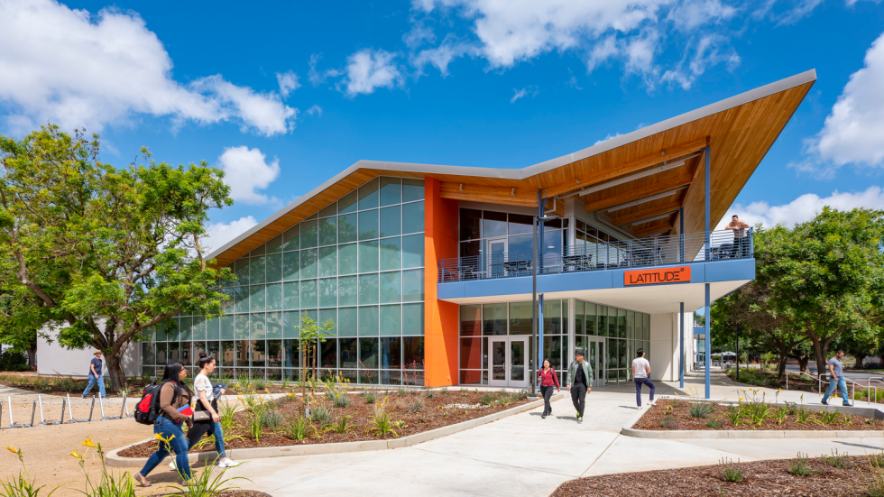
Photo by Kyle Jeffers, courtesy of HED.
UC Davis boasts a diverse international population with more than 15 percent of its student body hailing from another country. Helping students acclimate to their new college community can be challenging. Latitude, UC Davis’ new restaurant and market dining commons, is making that a little easier.
The new 500-seat eatery designed by Harley Ellis Devereaux has a decidedly international feel, which was intentional. “The vision is to bring a familiar flavor to someone from abroad, and provide some comfort and a sense of home while away,” says Kraig Brady, executive director of dining services at UCD. Armed with an executive chef, a culinary team and more than 90 international recipes, Latitude brings a taste of home to the Capital Region campus.
International student Kris Hanratanakool, who hails from Thailand, is especially fond of the gnocchi, but when he wants a familiar flavor, he tucks into the chicken satay. Hanratanakool, a senior, also works at Latitude as a student assistant. Both the food and his work experience have helped ease his transition to UC Davis. “I feel very comfortable when I am at Latitude because people here have different backgrounds just like me. And there is a lot of diversity in the food and it’s all amazing,” he says.
Three primary elements inspired the design of the space: the agricultural and engineering roots of the campus, serving a wider population beyond students and developing a destination hub around food. “We wanted to create a dynamic building that responds to the vernacular,” explains Anna MacDougall, associate principal for HED. “This is clearly a modern building, but a modern building with a rural spirit.”
The architects used functional materials that were also beautiful, like engineered hardwood, steel columns, a polished concrete floor and exposed timber structure. The expressive massive and soaring roofline extends over the main entrance, creating a double-height interior that shades the exterior terrace. Floor-to-ceiling windows bring in natural light and generate an open and welcoming space. Inside, the food platforms are also open and transparent so guests can see how the food is being cooked. The dishes are divided into four regional platforms: Europe and India, Latin America, Asia, and the Middle East. The required tools and machinery for each unique platform helped inform the design of the space. Things like open-flame grills to char meats, fryers for falafels and vertical rotating ovens to make shawarma were incorporated.
The architects created a myriad of seating options for people to eat, relax or study with quiet corners, a mezzanine, a terrace and outside seating. “Latitude is truly something special,” says Brady. “Not only is it designed to develop great food, but more importantly to deliver a space to celebrate through food, diversity, equity and inclusion for our campus community. Food has the power to bring people together and form strong communities.”
Latitude is open to the public as well as students, creating a center for learners and the community to gather. The project is certified LEED Gold through its use of renewable materials, energy consumption reduction, low-water landscaping and bike and pedestrian access.
The WELL expansion
Location: Sacramento State University
Architect: HMC Architects
Contractor: Swinerton Builders
Completed: 2021
Size: 55,000 square feet
Cost: $34 million
LEED status: Gold (pursuing WELL Building Certification)
Photos by David Wakely, courtesy of HMC Architects.
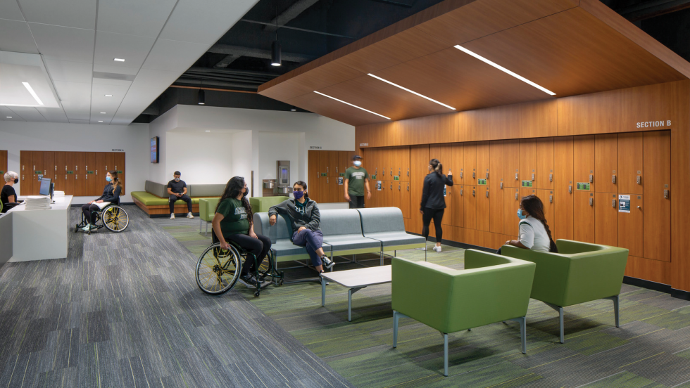
Sacramento State had a problem with its existing locker rooms. They did not have enough space to meet the needs of students, and it was clear the students wanted more privacy.
“We knew that we had an issue with our current locker room setup, and operationally it was causing us challenges,” says Kate Smith, director of the WELL at Sacramento State. “We knew there was a need for safety and privacy, and the definition of who needed privacy was really expanded.” The solution was an updated expansion of the university’s health and fitness facilities known as the WELL — Wellness, Education, Leisure and Lifestyle — including adding new welcoming and safe locker rooms that are gender neutral and accessible.
The WELL, whose mission is lifetime wellness through collaboration, education and innovation, first opened in 2010 on campus. The recreation and wellness center incorporates fitness, health care and social activity spaces under one roof. But after several years of observing how people and programs interacted with the space, Sacramento State found it needed to make some improvements to create a more welcoming environment and embarked on an expansion.
Sacramento-based HMC Architects honored the existing aesthetic of the project, using the same finishes and giving the exterior a 360-degree unified look with natural and sustainable materials on the facade. Inside, the objective was to modernize the spaces with an open layout and cohesive finishes. New integrated urgent care and counseling spaces were added, along with exam rooms and an athletic training facility that supports the entire student population.
The athletic and fitness spaces underwent the most extensive overhaul. HMC did a deep dive into the needs of the student and staff population, gathering input and feedback, helping to inform its parameters of universal design. The architects’ unique approach involved creating an all-gender space with comfortable lounge seating where students could gather, as well as safely and privately change.
The new space, known as the Retreat, includes seven all-gender private dressing rooms with several bays of lockers and public vanities to get ready. Single use showers are also available. Students that don’t need to shower can change in private, then store their gear and go. Transparent glass doors that remain open provide visible sight lines into the interior and gathering spaces, creating a safe collaboration zone.
“It’s interesting how we are taking this function that used to be completely isolated and a private thing to do and we’re opening it up by making it comfortable to be out in the open, yet still providing privacy. That occurs throughout the design,” explains David Perez, associate and senior project designer for HMC. Comfortable seating, along with tables and chairs, dot the space. A soothing spa playlist sets the tone in the background. The Retreat has become one of the most popular places at the WELL. “The overall vibe is very relaxing,” says Sacramento State senior Jocelyn Morgan, who also works at the WELL. A building supervisor is always stationed in the Retreat both for safety and to meet guests’ needs.
Alongside the all-gender space, traditional men’s and women’s locker rooms are available, and have been updated to be more comfortable for users. All of the expanded spaces are also fully accessible and have been maximized to accommodate a larger athletic wheelchair. Generous 46” doorways, which are 10” larger than the standard opening, allow participants to remain in their athletic wheelchairs to use all areas of the facilities. “We’re cutting down as many barriers as possible and not categorizing our spaces, but instead are creating spaces that are catered towards all abilities,” says Smith.
The project is certified LEED Gold; WELL Building Certification is also being pursued, which measures the holistic elements of the project. The WELL has won numerous awards, including outstanding facility, best recreational use facility and best higher education/research project.
SMUD Museum of Science and Curiosity
Location: Sacramento
Architect: Dreyfuss + Blackford
Contractor: Otto Construction
Completed: 2021
Size: 52,000 square feet
Cost: $40.8 million
LEED Status: Platinum
Photos by Kyle Jeffers, courtesy of Dreyfuss + Blackford.
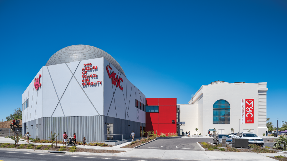
Erected just after the turn of the century, the historic electrical power station on the Sacramento riverfront sat vacant and unused for decades. The building was decommissioned, scavenged for scrap and eventually used as a salvage yard. It appeared destined for demolition. In a much-heralded public private partnership, the Powerhouse Science Center, the City of Sacramento, the Sacramento Office of Education and SMUD commissioned a rehabilitation of the historic space with the intention of transforming it into a hub for science education, exploration and promotion. The design-build team of Dreyfuss + Blackford and Otto Construction were given the monumental task of restoring the historic structure and designing a new space to create a prominent, welcoming and interactive science center.
The architects had to exercise care to protect the historic elements of the century-old building, particularly the exterior plaster. Achieving that entailed extensively mapping all of the cracks and repairing the skin of the building. Visitors are welcomed into the space through oversized wood doors clad in aluminum, which were rebuilt from historical data. The historic cartouche above the opening was crumbling and in desperate need of repair. As a precaution, the architects laser scanned the statuary and took high resolution photos of every single inch, which was fortuitous; during demolition, the piece crumbled. A new version was created out of foam using a CNC machine (an automated machine operated by a computer to create a custom-designed form). Local artist Stephanie Taylor was commissioned to recreate the human forms from the foam blank and Western Specialty Contractors detailed the remaining elements.
There were a lot of drivers informing the design of the new two-story, 22,000-square-foot addition. The City of Sacramento did not want anything to compete with the tall volume of the power station or turbine room. As a result, the new building is a shorter, smaller volume space that connects lightly to the historic building. It includes a lobby, classrooms, offices and a cafe. The planetarium was sited in the corner farthest from the turbine room to create some visual separation.
For the planetarium, the architects specified the largest possible, hemispherical dome that would fit in the building, then paired it with a cutting-edge projection system. The space seats up to 120 people, making way for multiple classrooms of students to visit for field trips, and for teachers to augment their STEM education programs.
One of the architects’ biggest challenges was the acoustic separation between the I-5 freeway and the planetarium. “The whole point of the planetarium is to be able to take you into an extremely quiet space, suspending that disbelief of being here on earth and immersing you in a show,” says Christopher Holt, senior associate for Dreyfuss + Blackford. The team worked extensively with an acoustic engineer to knock down all the sound. “The first day I walked into the finished space it was so quiet. For me that was one of those special takeaways as an architect to help the museum create that,” Holt says.
Inside, guests learn about STEM through interactive exhibits, live demonstrations, engineering design challenges, astronomy shows and immersive feature films. Each MOSAC exhibit also has an engagement component to it. Building Sacramento is a kinetic building environment, the Nature Detectives area features an active working beehive, SMUD’s Powering Change is dedicated to exploring alternative energy sources and the Water Challenge exhibit uses augmented reality to engage guests. “With all of the exhibits, we like to take global issues and show how they have local relevance,” says Michele Wang, executive director of MOSAC, “and how guests can learn through play.”
The project is certified LEED Platinum for its use of natural and sustainable materials, energy efficient systems, remediation of a classified brownfield site and the addition of a mass transit stop. It has been recognized with numerous awards ranging from preservation and design to project excellence.
Del Campo High School Science, Media Commons & CTE Building
Location: Fair Oaks
Architect: Nacht & Lewis
Contractor: XL Construction
Completed: 2021
Size: 45,680 square feet
Cost: $42 million
The 55-year-old campus of Del Campo High School had a number of buildings that weren’t functioning well as 21st century learning spaces. One was the derelict shop building in the back of campus that had long curtailed its wood and metal works classes. It was being used for other career technical education pursuits, but not effectively. The Fair Oaks high school was also in need of modern science and media commons space that were more collaborative and updated for current teaching technology.
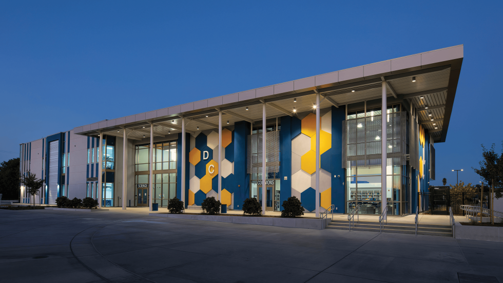
Sacramento-based architecture firm Nacht & Lewis was tapped to design the new spaces. The two-part project started with the renovation of the existing shop building to house new, more relevant CTEs, including pathways for television broadcasting, fire and EMT training and computer technology. The core learning space of the building houses a collaboration lab where each of the disciplines can interact and learn together. “This project was a nice way of breathing life into an old building that otherwise was sitting underutilized,” says Brian Maytum, principal-in-charge and education leader with Nacht & Lewis.
The new spaces — a two-story science center and media commons facility — were intentionally designed to be high-profile, highly visible spaces that reimagined the front door to the high school. They serve as a gateway to the heart of the campus. The new classroom building features 10 modern laboratories that are fully outfitted with the latest equipment to support both general and advanced sciences. A state-of-the-art media commons includes professional-level broadcasting equipment that encourages hands-on learning.
The new library space is hard to miss, punctuated by expansive glass and aluminum features that are both functional and beautiful. The fiberglass panels attached to the facade help to shade the building from the afternoon sun, while also allowing light to seep through. The bold geometric shapes are a nod to molecular structures and proudly display the school’s spirit colors of blue and gold. In keeping with its goal of creating a welcoming and collaborative space, the library and media commons are available to the community for after-hours activities. “We were all really anxious to try to make something that was very figural, not only in its design, but in its aesthetics,” says Maytum.
–
Stay up to date on business in the Capital Region: Subscribe to the Comstock’s newsletter today.
Recommended For You
Reimagining Commercial Corridors
Capital Region cities inject new investment into aging parts of town
Modern planning now focuses on elements beyond brick-and-mortar
retail and commercial. Community events, alternative
transportation with safe travel for pedestrians and bicyclists,
and redesigned streetscapes with drought-tolerant landscaping
have become central considerations.
Healing Grounds
Today’s health care architecture provides a holistic, calming environment
Stark and sterile health care buildings are falling by the
wayside as architecture firms design for a more
supportive patient experience.
Sponsored
Transforming Environments of Health
HGA
HGA, an interdisciplinary design firm with offices nationwide, provides architectural design and all disciplines of engineering. In Sacramento and throughout Northern California, the firm offers architecture, structural engineering, mechanical engineering, plumbing engineering and interior design.
Safeguarding Sacramento’s Historic Architecture
Architects, preservationists and historians work together to adaptively reuse Sacramento’s historic resources
Preservation projects are being embraced in the Capital
Region in an effort to preserve history and protect the
environment.
How to Build Out of a Pandemic
The commercial construction industry quickly adapted during the pandemic and continues to adjust its practices.
The Granny Flat Has a New Name
Architects are teaming with local jurisdictions to include accessory dwelling units and tiny houses in the affordable housing conversation.


